1/0
Styles
RegularBold
Italic
About Kateka

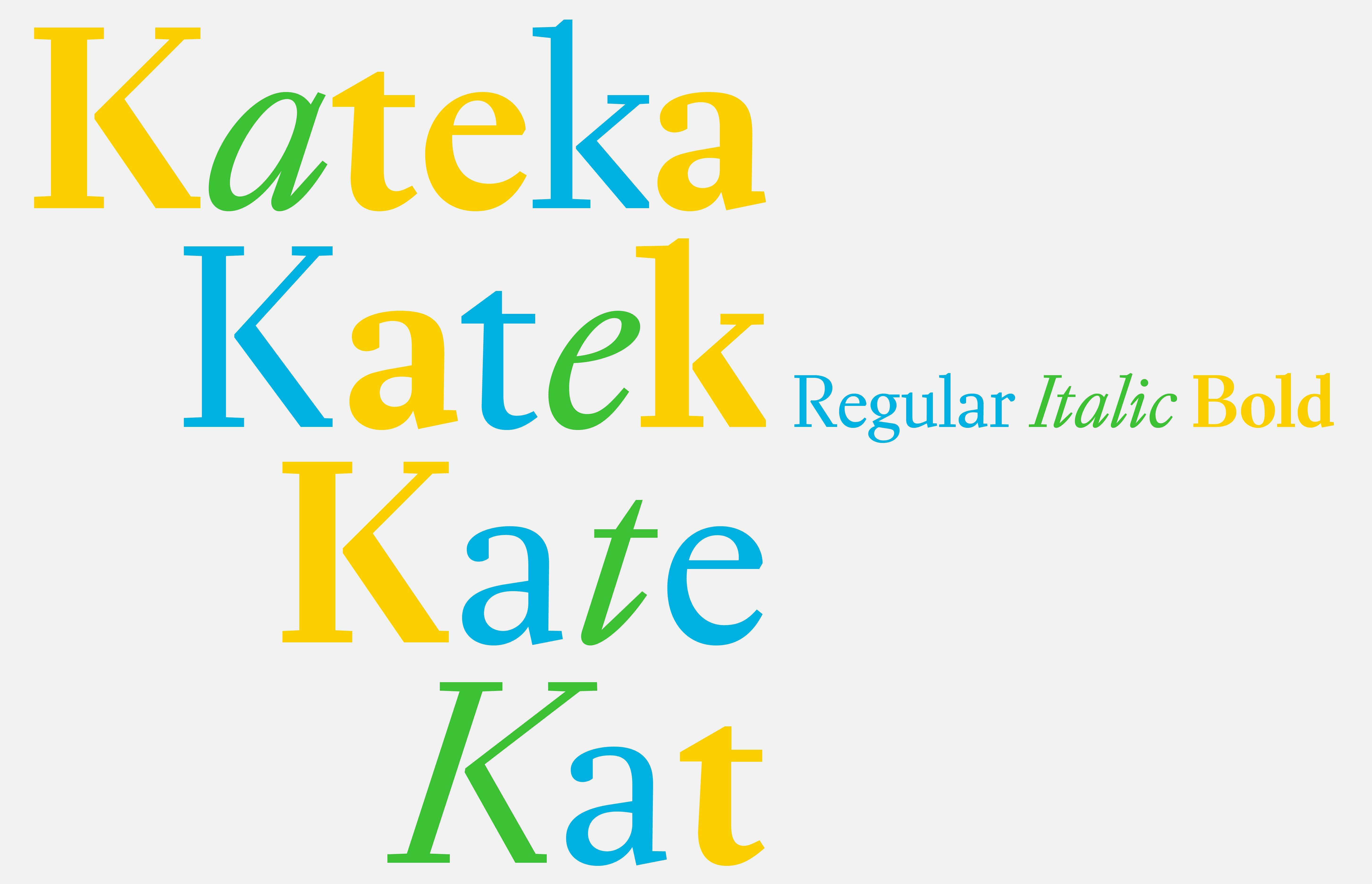
Kateka is an original creation that borrows some baroque details from the characters of 18th-century Dutch typographer Joan Michaël Fleischmann. Indeed, its aesthetics stem from in-depth research on text typography forms, conducted to create a functional and contemporary typeface directly linked to the history of typography.

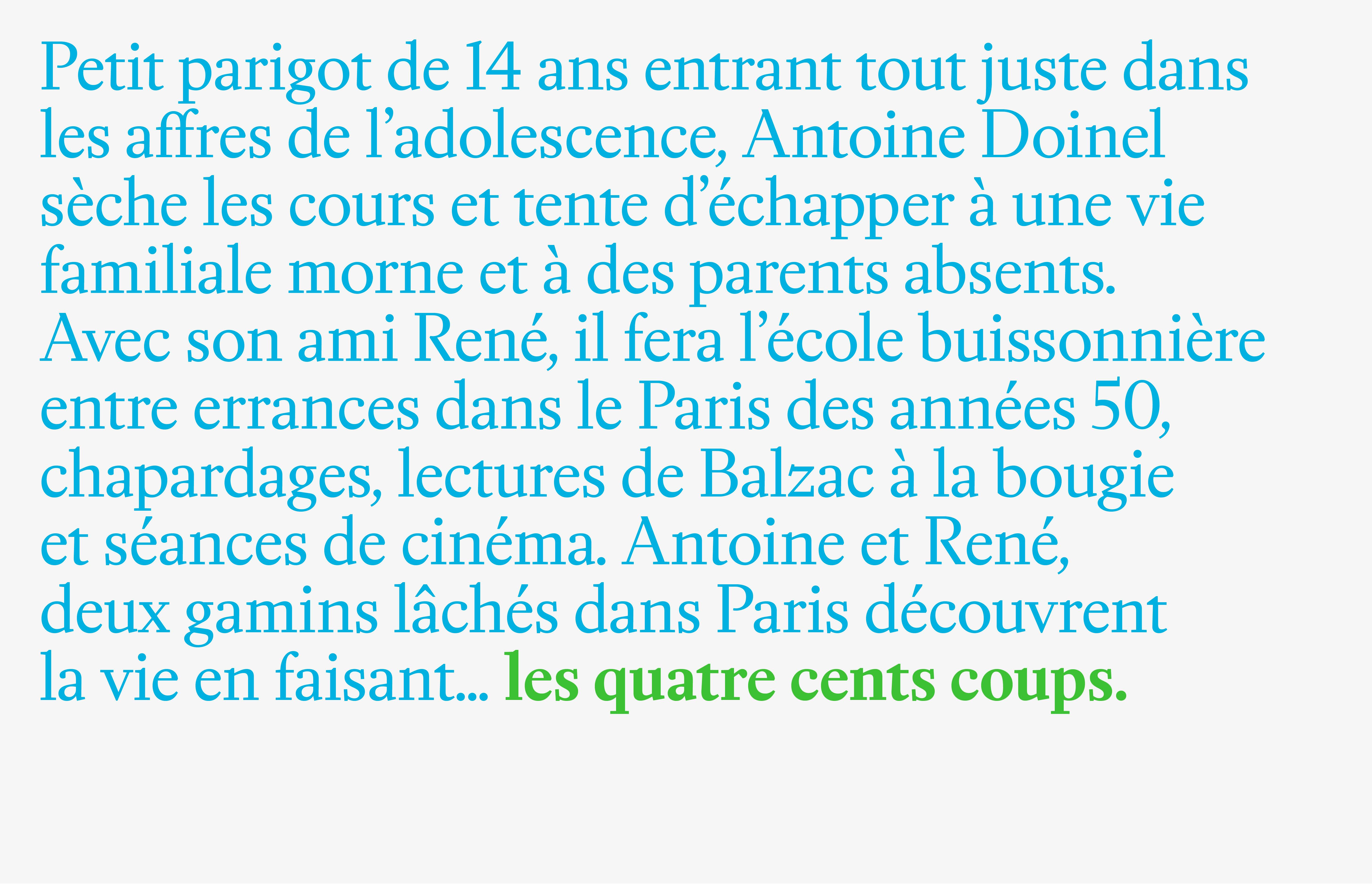
Kateka was designed after traditional text typography forms, which were then rationalized and modernized through an innovative approach to digital design. Each glyph has been drawn with as many straight lines as possible. This optimizes its readability on all types of screens while giving it a distinctly modern look.

Its high contrast and the pronounced slant of its italic style confer an elegant flair, allowing it to stand out in headings. Its clean design and precise shapes ensure good reading comfort in body text.

Design: Raphaël de La Morinerie
From 60€

“Kateka’s
sharp design
is inspired
by traditional
text letterforms
and rationalized
by innovative
digital approach.”

A
SPECIMENPDF Ag
A

Glyphset

A
Á
Ă
Ǎ
Â
Ä
Ȧ
À
Ā
Ą
Å
Ã
Æ
Ǽ
B
C
Ć
Č
Ç
Ĉ
Ċ
D
Ð
Ď
Đ
E
É
Ĕ
Ě
Ê
Ë
Ė
È
Ē
Ę
F
G
Ğ
Ǧ
Ĝ
Ģ
Ġ
H
Ħ
Ȟ
Ĥ
I
IJ
Í
Ĭ
Ǐ
Î
Ï
İ
Ì
Ī
Į
Ĩ
J
Ĵ
K
Ǩ
Ķ
L
Ĺ
Ľ
Ļ
Ŀ
Ł
M
N
Ń
Ň
Ņ
Ǹ
Ñ
Ŋ
O
Ó
Ŏ
Ǒ
Ô
Ö
Ȯ
Ò
Ő
Ō
Ǫ
Ø
Ǿ
Õ
Œ
P
Þ
Q
R
Ŕ
Ř
Ŗ
S
Ś
Š
Ş
Ŝ
Ș
T
Ŧ
Ť
Ţ
Ț
U
Ú
Ŭ
Ǔ
Û
Ü
Ù
Ű
Ū
Ų
Ů
Ũ
V
W
Ŵ
X
Y
Ý
Ŷ
Ÿ
Ȳ
Z
Ź
Ž
Ż
a
á
ă
ǎ
â
ä
ȧ
à
ā
ą
å
ã
æ
ǽ
b
c
ć
č
ç
ĉ
ċ
d
ð
ď
đ
e
é
ĕ
ě
ê
ë
ė
è
ē
ę
f
g
ğ
ǧ
ĝ
ģ
ġ
h
ħ
ȟ
ĥ
i
ı
í
ĭ
ǐ
î
ï
ì
ij
ī
į
ĩ
j
ȷ
ĵ
k
ǩ
ķ
l
ĺ
ľ
ļ
ŀ
ł
m
n
ń
ň
ņ
ǹ
ñ
ŋ
o
ó
ŏ
ǒ
ô
ö
ȯ
ò
ő
ō
ǫ
ø
ǿ
õ
œ
p
þ
q
r
ŕ
ř
ŗ
s
ś
š
ş
ŝ
ș
ß
t
ŧ
ť
ţ
ț
u
ú
ŭ
ǔ
û
ü
ù
ű
ū
ų
ů
ũ
v
w
ŵ
x
y
ý
ŷ
ÿ
ȳ
z
ź
ž
ż
Δ
Ω
μ
π
0
1
2
3
4
5
6
7
8
9
½
¼
¾
¹
²
³
.
,
:
;
!
¡
?
¿
·
*
#
/
\
-
_
(
)
{
}
[
]
«
»
"
'
ƒ
@
&
§
©
®
°
|
¦
¢
¤
$
£
¥
+
×
÷
=
>
<
±
~
¬
^
%
Buy
About
Try
Glyphs
In use
;
01
LICENSE
For more licencensing options like logotype, video broadcasting, hardware and merchandise, please get in touch.
02
COMPANY SIZE
Please select the size of your client's company or yours if you will use the font for your own business.
0