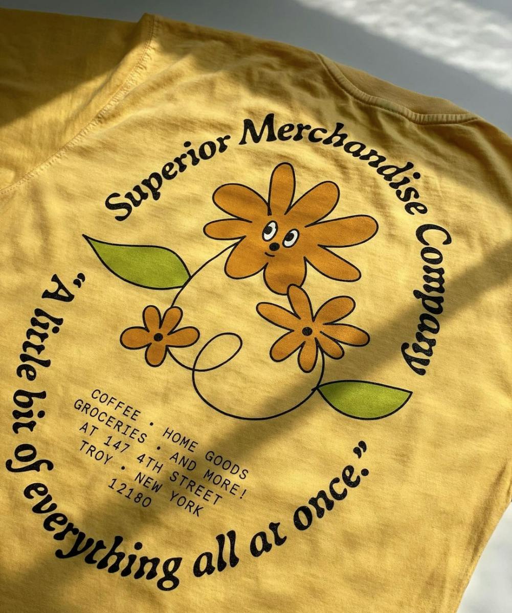
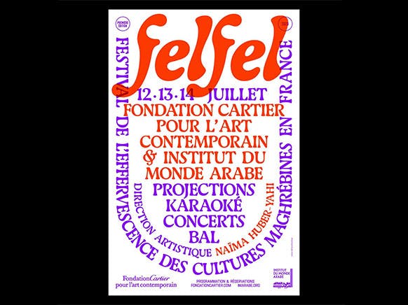
Gaya draws inspiration from objects polished by the wear of ordinary use. The kind of use that shapes them to our hands and gives them so much personality. Its design seeks to capture the appearance of those objects whose forms testify to longevity and efficiency.
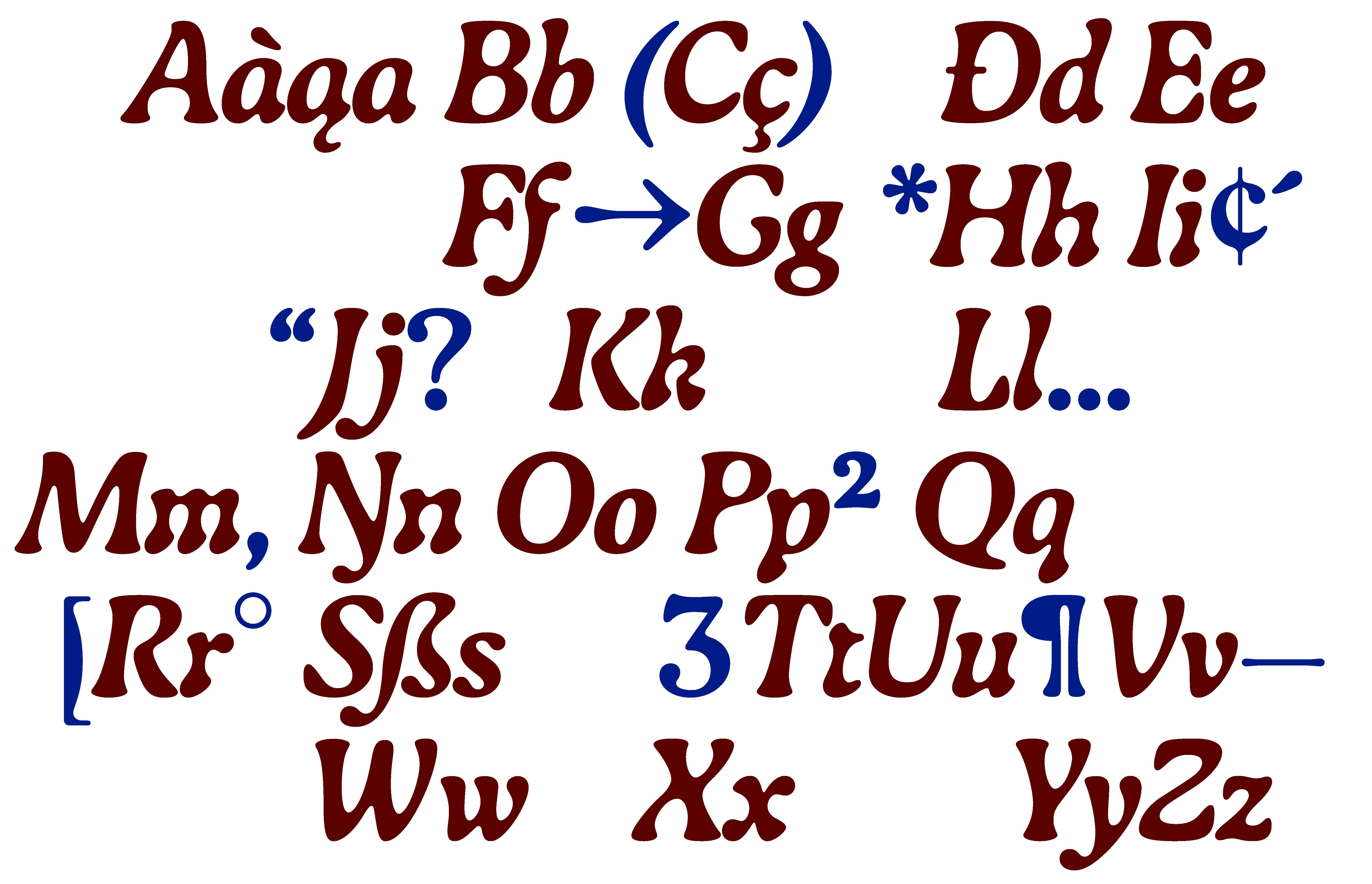
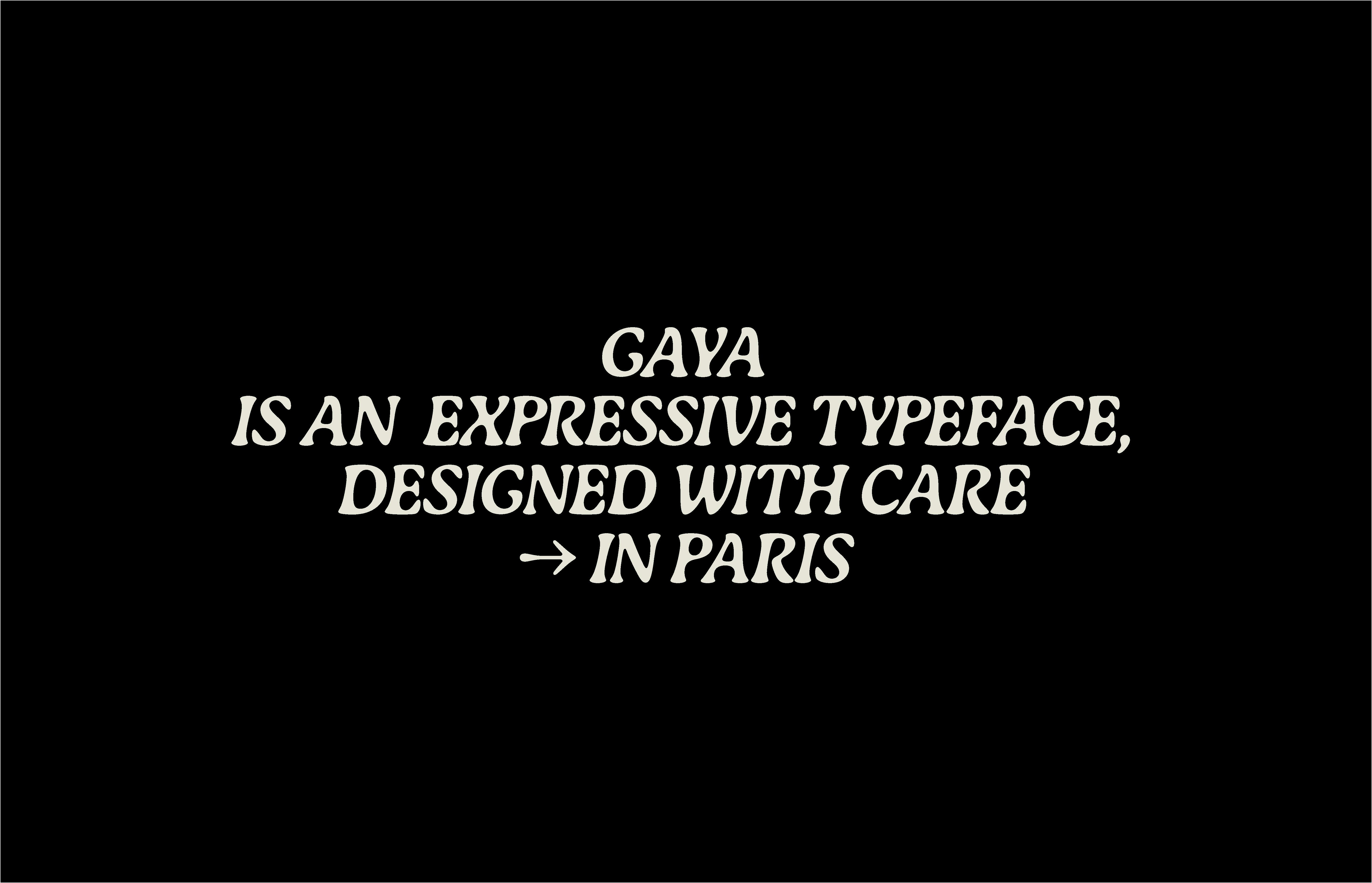
Its organic appearance originates from the study of the effects of blur on typography. The result is curved shapes that harmonize with the round forms, creating a fluid expression. This expression is further emphasized in the italic style and is reinforced by a large number of ligatures.
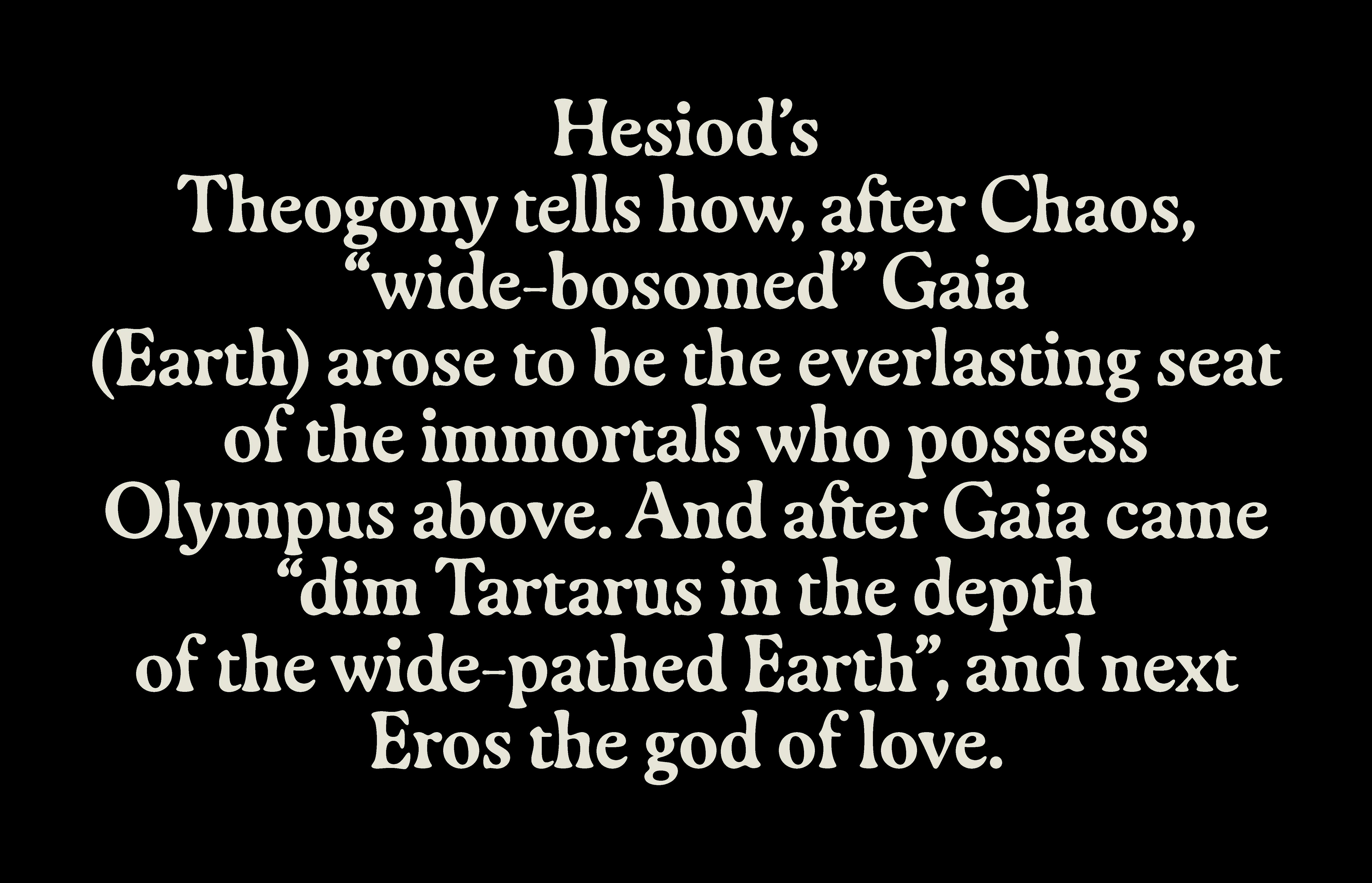
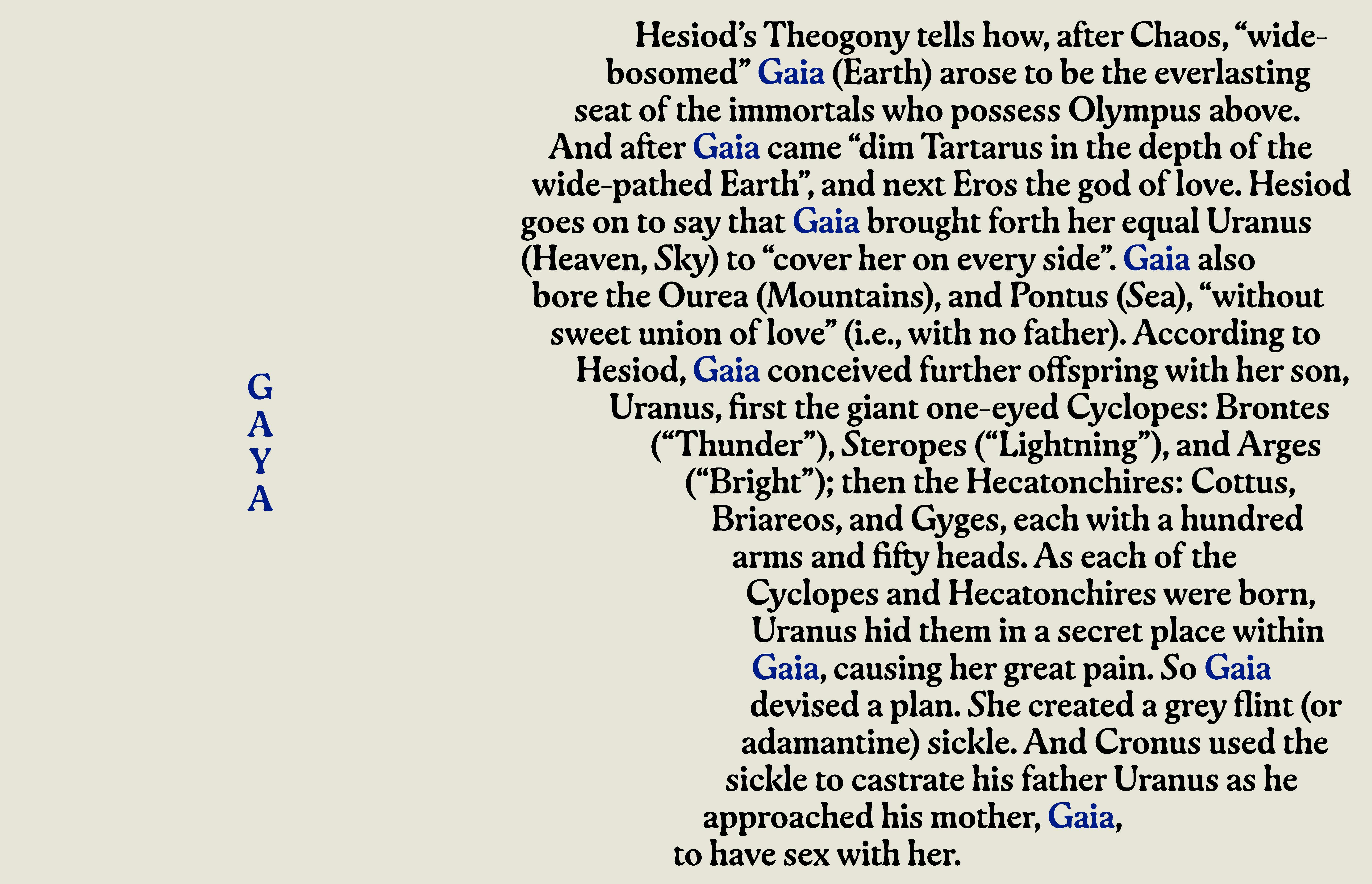
The warm shapes of Gaya follow the structure of text characters. Its precise design ensures good legibility and balanced typographic texture. Gaya finds its way between independent artistic projects and visual identities for cultural institutions. The typeface has been commercially available since 2020 and is used, for example, in the communication of concert halls and festivals, as well as in the layout of books and magazines.
Typeface
with
wavy forms.
Gaya
is
super soft
to
your eyes

